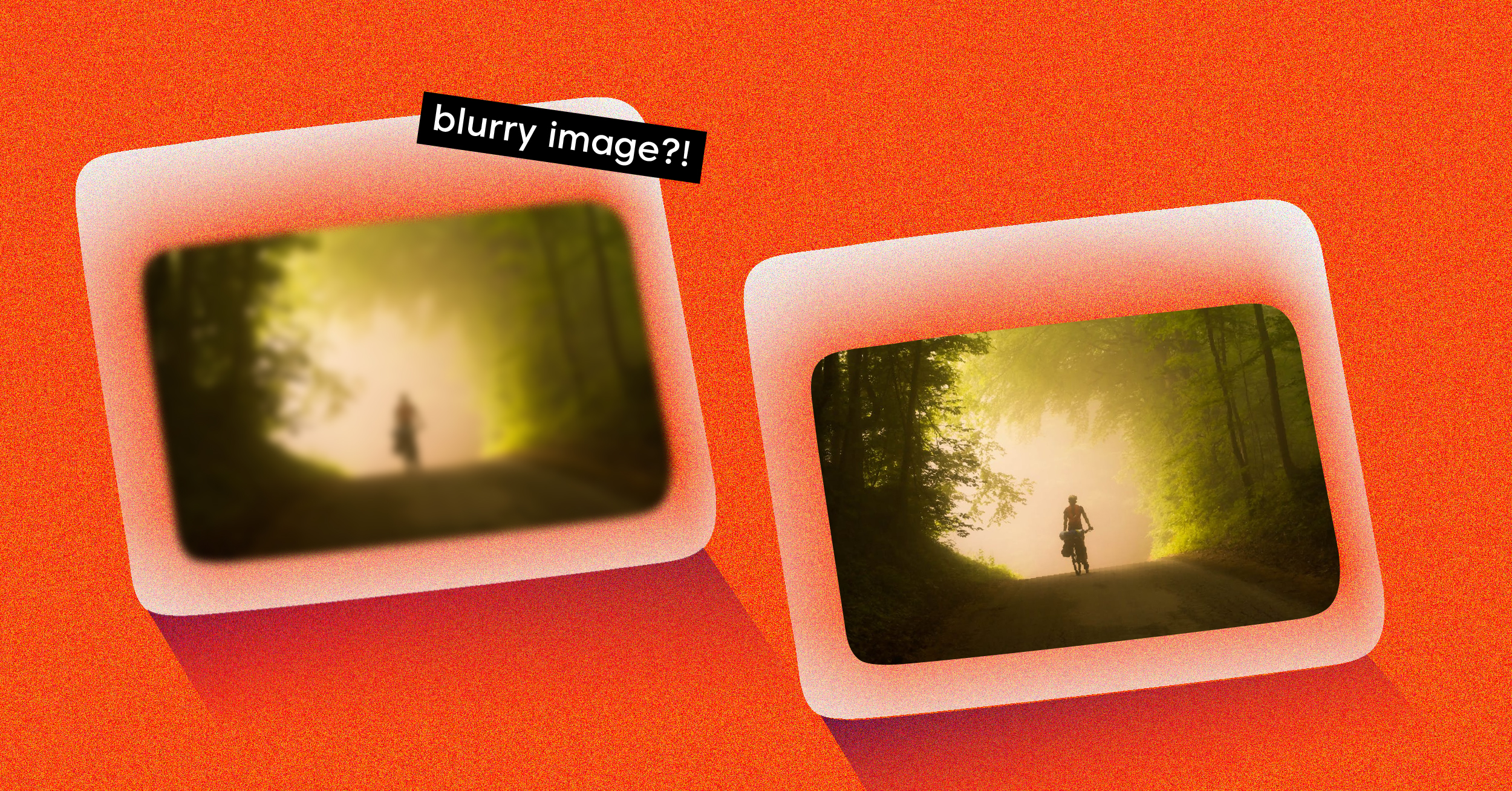
Have you ever stared at a blank white box on a webpage, waiting for an image to pop into existence? It feels slow, broken, and honestly, a bit frustrating. That’s where the blurry image loading technique—often called the “blur-up” effect—comes in.
The idea is simple but incredibly effective: instead of showing nothing, you first display a tiny, heavily blurred version of the final image. This placeholder loads almost instantly, and then, as the full-resolution image arrives, it gracefully fades in to replace the blur. It’s a clever trick that dramatically improves how fast your site feels.
The Power of Blurry Image Loading on User Perception
Before we jump into the code, it’s worth understanding why this works so well. Human psychology is a huge factor in web performance. A blurry preview gives our brains something to process immediately. It signals that content is on its way, turning a moment of potential frustration into one of anticipation.
This small shift in perception is a game-changer. It makes your page feel faster, keeps visitors engaged, and drastically reduces the chances they’ll hit the back button.
Enhancing Core Web Vitals
Beyond just making users happier, the blur-up technique directly improves the performance metrics Google cares about for ranking. It has a real, measurable impact on two of the three Core Web Vitals.
We can see a clear connection between this loading strategy and better performance scores.
Impact of Blurry Loading on Core Web Vitals
| Core Web Vital | Impact of Blurry Image Loading | Why It Matters |
|---|---|---|
| Largest Contentful Paint (LCP) | Significantly Improved. The tiny, blurred placeholder renders almost instantly, giving you a much faster LCP time. | LCP measures when the main content of a page is visible. A fast LCP tells users and Google that your page loads quickly. |
| Cumulative Layout Shift (CLS) | Drastically Reduced. The placeholder reserves the exact space for the final image, preventing content from jumping around as it loads. | A low CLS score means your page is visually stable. It’s a key indicator of a good, non-frustrating user experience. |
| First Input Delay (FID) | Indirectly Positive. By optimizing image loading, the main thread is less blocked, potentially improving responsiveness. | FID measures how quickly a page responds to user interaction. A snappy site is always a better experience. |
By addressing LCP and CLS head-on, you’re not just creating a smoother visual effect; you’re also sending strong positive signals to search engines about your site’s health.
Real-World Application and Benefits
This isn’t just a theoretical trick; major platforms have been using it for years. Think of sites like Medium. When you open an article on a spotty connection, you see those soft, blurry shapes that resolve into crisp photos. Without them, the page would be a jumble of empty gaps, making for a terrible reading experience.
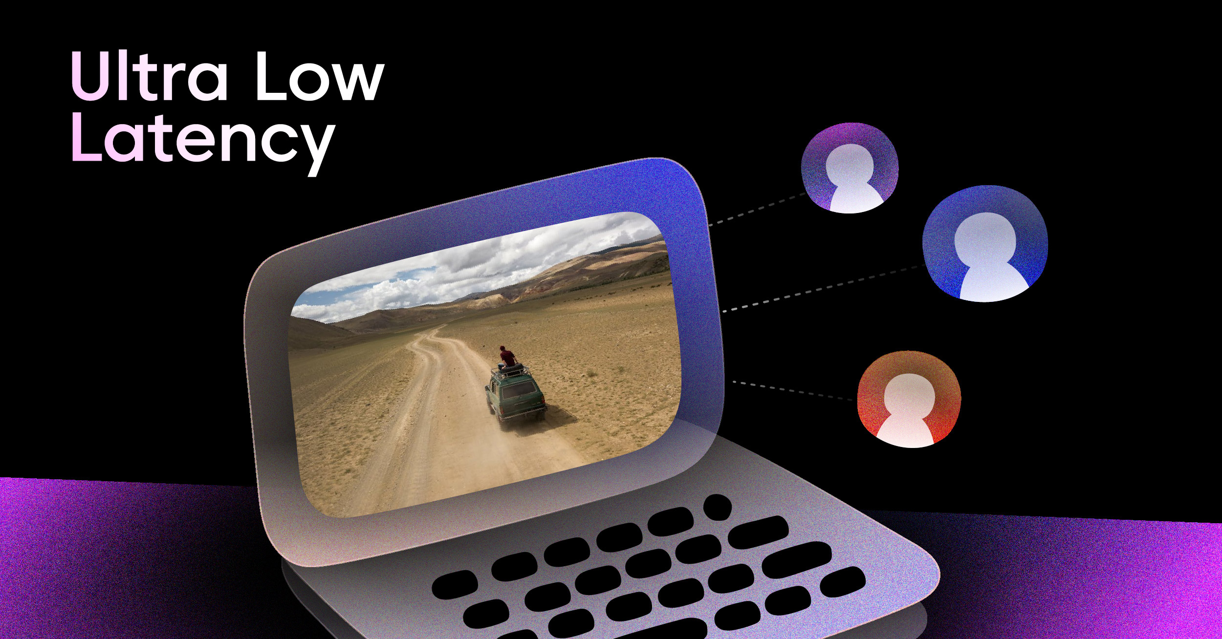
The same logic applies to video. Displaying a placeholder image is fundamental to maintaining a stable layout before a player fully loads, a core concept when you’re figuring out how to stream live video without disrupting the user’s view.
A well-executed blurry loading technique does more than just fill a space; it manages user expectations, improves performance metrics, and signals a high-quality, polished user experience.
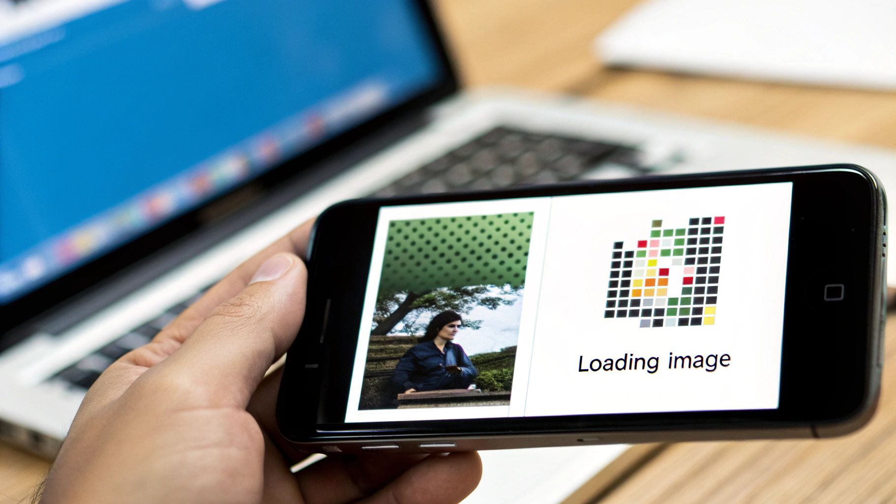
At the heart of any blurry image loading setup is the placeholder itself. This isn’t just a randomly shrunken version of your image; it’s a strategically crafted, featherlight preview that has to load in a blink. The whole point is to give users a visual hint of the final picture while keeping the file size ridiculously small.
So, how do you actually make these things? The best way is to generate them automatically when you build your site. Trying to create them on the fly for every single person who visits your page is a recipe for a slow server. If you’re working in a Node.js environment, a library like Sharp is your best friend for this task.
Getting the Generation on Autopilot
With a surprisingly simple script, you can automate this entire workflow. You’ll just need to point it at a folder of your high-resolution images. For each one, the script will shrink it down to a tiny size—I’m talking 32×32 pixels or even smaller—apply a bit of blur, and save it in a super-efficient format.
When it comes to the output, you have a couple of solid options:
- Tiny Image Files: You can generate minuscule WebP or AVIF files. These get cached by the browser, which is great, but they still require their own network request to load.
- Base64 Strings: This involves encoding the tiny image directly into a string of text. You then embed this string right into your HTML, which completely eliminates that extra network request. The trade-off is a slightly larger HTML file.
For most modern websites, especially for critical images that appear “above the fold,” embedding a Base64 string is the way to go. It’s faster and simpler.
This whole concept of a tiny, blurred placeholder has been around for a while. Facebook actually popularized it back in 2015 to deal with loading big photos on slow mobile connections. Their engineers pioneered what we now call the Low-Quality Image Placeholder (LQIP) technique, getting placeholders down to a mere 200 bytes. You can learn more about this bit of web performance history and see how modern formats have pushed the boundaries even further.
Finding That Sweet Spot
The real art here is striking a balance between file size and what the placeholder actually looks like. You want just enough detail for the user’s brain to register the image’s basic shape and colors, but not so much that the placeholder itself starts to get heavy. A common pitfall is making the placeholder too big or forgetting to compress it aggressively.
Here’s a quick and dirty example of how you could use Sharp.js to create a Base64 placeholder from an image.
const sharp = require(‘sharp’); const fs = require(‘fs’);
async function createPlaceholder(imagePath) { try { const originalImage = fs.readFileSync(imagePath); const placeholderBuffer = await sharp(originalImage) .resize(20) // Shrink to 20px wide, height adjusts automatically .blur(2) // Add a light blur .toBuffer();
const base64Placeholder = `data:image/jpeg;base64,${placeholderBuffer.toString('base64')}`;

console.log(base64Placeholder);
return base64Placeholder;
} catch (error) { console.error(‘Error creating placeholder:’, error); } }
// How to use it: createPlaceholder(‘./images/high-res-photo.jpg’); In this script, we’re taking an image, shrinking it to a tiny 20 pixels wide, and adding a gentle blur. By keeping the dimensions this small and letting the library handle compression, you can easily keep your placeholders well under 1KB. That’s small enough to have virtually zero impact on your page’s initial load time.
How to Implement the Blur-Up Effect

Alright, you’ve got your tiny, blurred placeholders. Now for the fun part: making the magic happen on the front end. This whole effect boils down to a clever combination of HTML, CSS, and a little bit of JavaScript to handle the switch.
Let’s walk through a real-world example. The basic idea is to stack the blurry placeholder and the final high-resolution image on top of each other. We’ll show the placeholder first, and once the full-quality image is ready, we’ll fade it in for that signature smooth “blur-up” transition.
Structuring the HTML
First thing’s first, we need a simple, solid HTML structure. I’ve found a wrapper <div> works best. Inside, you’ll nest both the low-quality placeholder and the final image. The trick is to use a data-src attribute to hold the high-res image URL, which we’ll grab with JavaScript later.


This keeps things clean and semantic. The placeholder loads immediately since it’s in a standard `src` attribute, while the browser won’t try to download the high-res image until we tell it to.
Styling with CSS for a Smooth Transition
Next up, CSS. This is where the visual flair comes from. We’ll use absolute positioning to stack the two images inside their container. The placeholder gets a blur filter, and the final image starts with an opacity of 0 to keep it hidden.
.blur-load { position: relative; overflow: hidden; }
.blur-load img { position: absolute; top: 0; left: 0; width: 100%; height: auto; transition: opacity 0.5s ease-in-out; }
.blur-load .placeholder { filter: blur(10px); transform: scale(1.1); /* Prevents blurry edges */ }
.blur-load .final-image { opacity: 0; }
.blur-load.loaded .final-image { opacity: 1; }
.blur-load.loaded .placeholder { opacity: 0; } Pay attention to that transform: scale(1.1) on the placeholder. It’s a handy little trick I use to avoid the hard, pixelated edges that can sometimes ruin the effect. This simple line makes the whole thing look much more polished and is a common fix when implementing blurry image loading.
Pro Tip: Keep your CSS transitions snappy but smooth. I’ve found a duration between 300ms to 500ms hits the sweet spot. Too slow, and the page feels sluggish; too fast, and you lose that graceful transition altogether.
Bringing It to Life with JavaScript
Finally, we need some JavaScript to tie it all together. The modern, and by far most efficient, way to do this is with the Intersection Observer API. It lets us detect when an element scrolls into the viewport without the performance hit of traditional scroll listeners. We only load what the user is about to see.
This is worlds better than listening for scroll events, especially on pages with tons of images. Efficient asset loading is also critical for more complex media, like video. If you’re interested, we touch on similar performance principles in our guide on how to embed a live stream on your website.
Here’s the complete JavaScript you’ll need:
document.addEventListener(“DOMContentLoaded”, () => { const blurContainers = document.querySelectorAll(“.blur-load”);
const observer = new IntersectionObserver((entries, observer) => { entries.forEach(entry => { if (entry.isIntersecting) { const container = entry.target; const finalImage = container.querySelector(“.final-image”);
    // Create a temporary image to load in the background
    const tempImage = new Image();
    tempImage.src = finalImage.dataset.src;

    tempImage.onload = () => {
      finalImage.src = finalImage.dataset.src;
      container.classList.add("loaded");
    };

    observer.unobserve(container); // Stop observing once loaded
  }
});
});
blurContainers.forEach(container => { observer.observe(container); }); });
What this script does is pretty straightforward. It finds all our .blur-load containers and starts “watching” them. As soon as one scrolls into view, the script creates a new image in memory and tells it to download the URL from our data-src attribute. Once it’s fully downloaded, the onload event fires, we swap the real <img> tag’s source, and add the .loaded class to kick off our CSS fade-in. Simple, robust, and great for performance.
Taking Your Image Optimization to the Next Level
Once you’ve got the basic blur-up effect running, it’s time to really dial in the performance. We’re talking about squeezing every last drop of speed out of your images. This is where we move beyond the basics and start working with modern image formats and smart delivery techniques.
Say Hello to Modern Image Formats
Look, JPEGs and PNGs have served us well, but formats like WebP and AVIF are the future. They’re a massive leap forward, offering much smaller file sizes for the same visual quality. Smaller files mean faster downloads—it’s that simple.
The great news is you don’t have to manage this manually. Most modern build tools and image CDNs will handle the conversion for you automatically when you upload your images. This trick works for both the final, high-res image and your tiny placeholder. An AVIF placeholder can be ridiculously small, making that initial page load even snappier.
Serve the Right Image Size with Srcset
One of the most common performance killers I see is a website serving a huge, desktop-sized image to a tiny mobile phone screen. It’s a total waste of bandwidth and makes the page crawl.
The fix? The srcset attribute. It’s a powerful HTML feature that lets you provide a list of different-sized images, and the browser intelligently picks the best one for its current screen size.
To make this work with our blur-up technique:
- Instead of
data-src, you’ll use adata-srcsetattribute on your<img>tag. - Your JavaScript will then copy the contents of
data-srcsetover to the actualsrcsetattribute once the image is ready to load.
This one change ensures your mobile visitors get a much faster, lighter experience. It’s absolutely essential for any responsive website.
Use a Comparison Table to Choose the Right Placeholder Method
There’s more than one way to generate a placeholder. I’ve put together a quick comparison to help you decide which approach fits your project best.
Placeholder Generation Method Comparison
| Method | Pros | Cons | Best For |
|---|---|---|---|
| Solid Color | Easiest to implement; no extra HTTP request. | Can feel jarring; doesn’t represent image content. | Simple sites or when image aspect ratio is the main concern. |
| Base64 | No extra HTTP request; instant placeholder. | Increases HTML document size; can be slow for many images. | Above-the-fold content where an instant placeholder is critical. |
| Tiny LQIP | Separate, cacheable file; doesn’t bloat HTML. | Requires an extra HTTP request (though it’s tiny). | Most use cases, especially for pages with many images. |
| SVG (e.g., SQIP) | Extremely small; vector-based placeholder. | Can be computationally expensive to generate. | Projects where asset size is the absolute top priority. |
Each method has its trade-offs. For most of my projects, a tiny, cached Low-Quality Image Placeholder (LQIP) offers the best balance of performance and user experience.
Let Your Framework Do the Heavy Lifting
If you’re working with a modern front-end framework like Next.js or Nuxt, you’re in for a treat. These frameworks usually ship with incredibly powerful, built-in image components that handle almost all of this optimization for you.
Take the Next.js <Image> component, for instance. It automatically:
- Creates multiple image sizes.
- Serves modern formats like WebP.
- Generates a blurred placeholder (either Base64 or from a tiny image file).
- Handles lazy loading.
Leaning on these built-in tools is a huge time-saver. It means you get best-in-class performance without having to write all the complex logic from scratch.
This chart shows just how much of a difference these kinds of optimization strategies can make on load times.
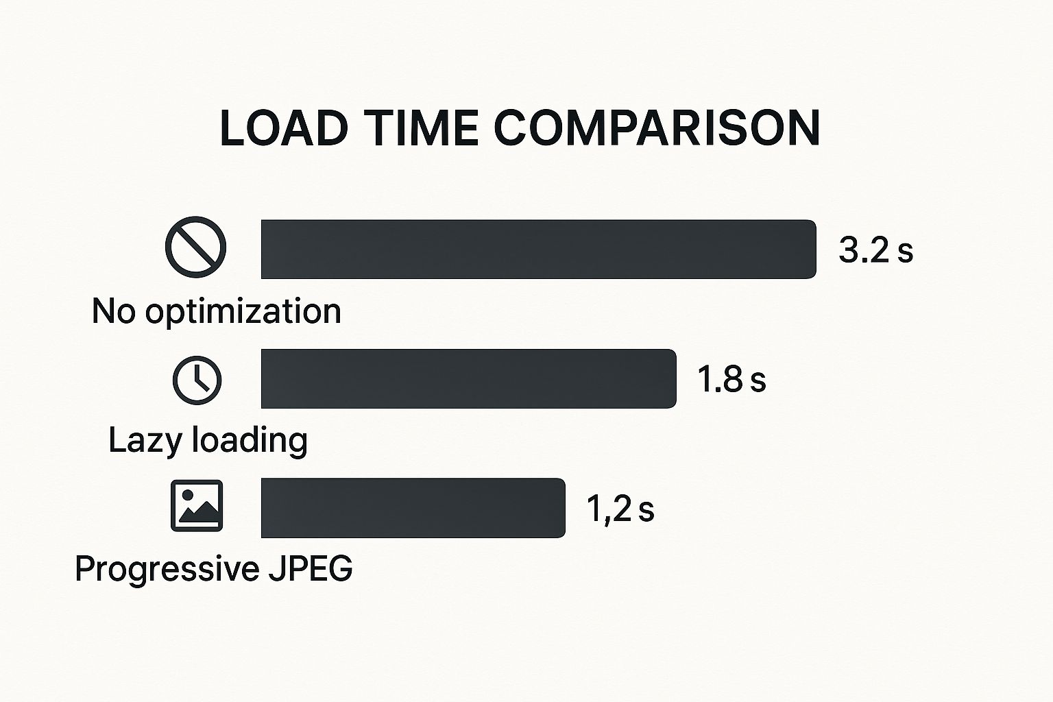
As you can see, implementing any form of progressive loading is a dramatic improvement over just dumping a full-res image on the page.
The challenge of making images clear isn’t just a web performance issue. In fields like photography and computer vision, researchers are constantly developing new ways to deblur images. A great example is the MC-Blur dataset, a massive collection of blurry photos used to train algorithms that can automatically fix issues like motion blur. You can check out the research paper to see just how deep this science goes.
A Quick Word on Accessibility
Finally, don’t let all this fancy loading get in the way of accessibility. Every image needs descriptive alt text. Since our blur-up technique uses two <img> tags (the placeholder and the final image), make sure the alt text is identical on both. This ensures screen readers announce the image’s content correctly just once, providing a seamless experience for everyone.
These principles of efficient, progressive delivery aren’t just for images, either. They apply to all sorts of media, which you can read more about in our guide on selecting a CDN for video streaming.
Common Blurry Loading Pitfalls and How to Fix Them
Implementing a blurry image loading technique can feel like a huge win for your site’s performance, but it’s easy to stumble into a few common traps. I’ve debugged my fair share of these implementations, and they almost always boil down to the same handful of issues.
One of the sneakiest problems is the “double download.” This is when the browser loads both the tiny placeholder and the full-resolution image at the same time, which completely defeats the purpose of the technique. You end up wasting bandwidth instead of saving it.
This usually happens when you mistakenly put the high-res image URL in the src attribute. Remember, the browser immediately fetches whatever it finds in src. The full-size image URL needs to live in a data-src attribute until you’re ready for it.
Preventing Layout Shifts and Failed Loads
Another classic mistake is ignoring aspect ratios. If your placeholder is a different shape than the final image, you’ll get that jarring content jump when the high-res version finally loads in. This is a direct hit to your Cumulative Layout Shift (CLS) score, which is bad news for both user experience and SEO.
The fix is surprisingly simple: make sure the placeholder container maintains the same aspect ratio as the final image. A little CSS is all you need.
.blur-load { aspect-ratio: 16 / 9; /* Or whatever your image ratio is / background-color: #eee; / Fallback color */ } .blur-load img { width: 100%; height: 100%; object-fit: cover; } This CSS forces the container to hold its shape, creating a stable box for the final image to load into. No more jumping content.
But what if the main image never arrives? A network error could leave your user staring at a blurry mess forever. That’s why you absolutely need some basic error handling.
A simple
onerrorevent on your<img>tag can save the day. If the high-res image fails, you can use JavaScript to hide the container, swap in a fallback graphic, or just leave the low-quality placeholder visible. Anything is better than a broken experience.
Fine-Tuning the Visuals
Finally, let’s talk about the look and feel. It’s tempting to crank up the blur effect, but a heavy filter: blur(20px) can often just look like a pixelated smudge rather than an elegant placeholder.
My advice? Be subtle. I’ve found that a blur radius between 5px and 10px is the sweet spot. It’s enough to hide the low quality of the tiny placeholder image without looking jarring. This small detail keeps the transition feeling smooth and professional, which really adds up when you have a site full of images.
Got Questions? Let’s Clear Things Up
Whenever you dive into a new web performance technique, a few questions always pop up. Let’s tackle the most common ones I hear about implementing the blur-up effect so you can move forward with confidence.
Will This Blurry Loading Thing Hurt My SEO?
Quite the opposite, actually. When you do it right, blurry image loading is a net positive for SEO.
It directly improves how fast your page feels to users, which boosts key metrics like Largest Contentful Paint (LCP). It also prevents content from jumping around as images load, which is great for your Cumulative Layout Shift (CLS) score. Since these are part of Google’s Core Web Vitals, you’re actually sending positive signals to search engines.
The trick is making sure the bots can still find your full-resolution image. As long as you have the high-quality image URL in an attribute like data-src that JavaScript later swaps in, you’re golden.
Base64 Placeholders or Tiny Image Files—Which is Better?
This one comes down to a classic trade-off. A base64-encoded string gets embedded right into your HTML, which means no extra network request. That’s a huge win for critical, above-the-fold images you want to render instantly.
The downside? It makes your initial HTML file bigger and can’t be cached by the browser. On the other hand, a tiny image file—think a 1KB WebP—needs a quick network request, but it can be cached. This is more efficient if you’re reusing the same placeholder across many different pages. For most modern builds, though, the base64 approach is incredibly popular and effective.
My Rule of Thumb: Use Base64 for unique, critical images to kill the network request. Go with tiny, cacheable image files for placeholders you use all over your site.
Can I Pull This Off Without JavaScript?
Not really, at least not if you want the full performance benefit. You absolutely need CSS for the visual magic—the filter: blur() effect and the nice, smooth fade-in transition. But the lazy-loading part, which is what makes this so efficient, is all JavaScript.
Specifically, we rely on the Intersection Observer API. This is the JavaScript workhorse that watches for an image to scroll into the viewport. It’s the trigger that tells the browser, “Okay, now’s the time to fetch the real image.” Without it, you’d be downloading all your high-res images at once, which kind of defeats the whole purpose.
Ready to deliver flawless, high-quality video streams to your users? LiveAPI provides the robust infrastructure and simple APIs you need to build powerful video applications without the hassle. Get started today and see how easy professional streaming can be. Explore LiveAPI now.